
In this article, we use TwitterTrails[i] to follow and analyse the online conversation about the contentious Irish abortion referendum. This referendum offers a useful opportunity for study because it is one of the first referendums in a Western democracy since 2016, when the phenomenon of misinformation on the Internet first gained prominence.
Following the revelations of foreign social media interference during the 2016 U.S. presidential election, the Irish referendum was widely seen as a test for social media companies’ ability to protect voters from election meddling.[ii] Some social media companies, such as Facebook and Google, had taken action and previously introduced tools to improve transparency. Indeed, eventually, Facebook blocked political advertising from groups outside Ireland altogether. Google soon joined this effort and also banned all adverts relating to the referendum on its platforms, including YouTube. Unlike the other tech companies, Twitter did not take special measures to protect Irish voters from social media manipulation, though it introduced a Political Campaigning Policy in the United States on 24 May, a day before the Irish referendum on 25 May 2018. This makes mapping and analysing the conversations about the Irish referendum on Twitter especially interesting.
Creating a co-retweeted (coRT) network
To understand who the key players in the discussion on Twitter were, we looked at the co-retweeted (coRT) network of users, which shows the strength of the relationship between users according to the audience who retweet them. Thus, the coRT network shows the users with higher visibility and the clusters that they form according to the audience. The coRT network connects two users when they have both been retweeted by someone else on a particular topic (in our case, the Irish referendum).
Each user is a point in the network, or a node. The size of the node reflects the activity level of the user; the more a user is retweeted, the larger its node. The distance (length of the edge) between the two nodes reflects the extent to which people in the audience retweet both of the corresponding users; the more a pair of users is retweeted, the shorter the distance between the users’ nodes. This naturally forms clusters of users in the coRT-retweeted network.
We visualise the networks users form on Twitter in the conversation about the Irish referendum at two points in time, shortly before the referendum, and shortly after the referendum. Both the before and after networks are available to view in an interactive version on the TwitterTrails site. [iii] Our algorithms can clearly identify the two sides of the debate: people who are in favour of the Eighth Amendment being repealed are coloured in cyan, and people who favour keeping the amendment are coloured in red.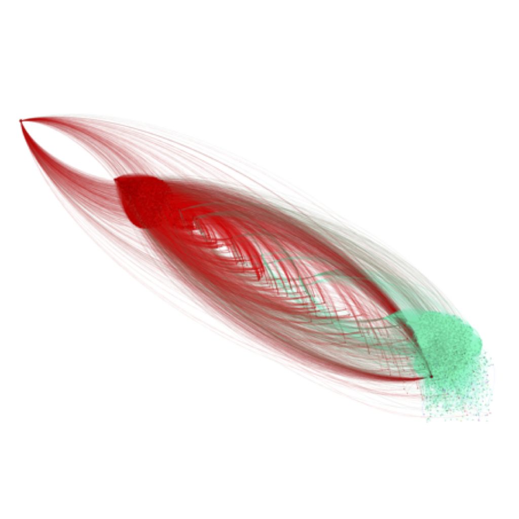
Figure 1. TheCoRT-retweeted network BEFORE the Irish referendum.
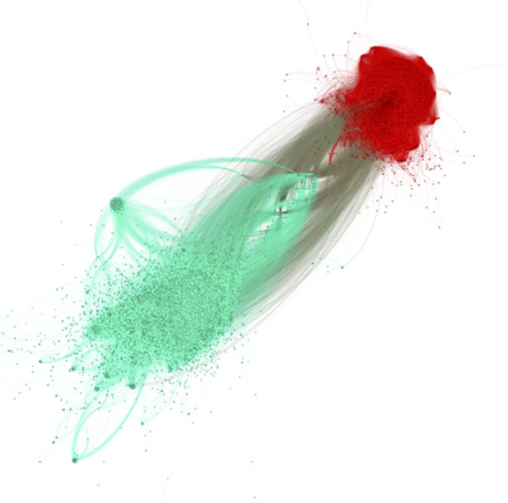
Figure 2. TheCoRT-retweeted network AFTER the Irish referendum.
In the two visualizations above, groups and communities are largely the same (The orientation of the visualization is irrelevant), with a few exceptions: The two nodes in the extremes of the red group in the BEFORE visualization, and the separate cyan small cluster in the AFTER visualization indicate spamming activities of the account owners, as we explain below.
Key players in the Twitter conversation
It is evident that there were a relatively small number of key players driving conversations. On both the pro-repeal (cyan) and anti-repeal (red) sides, the discussion was led by organised campaigns, journalists, and accounts of traditional media such as newspapers. On the repeal side, the most vocal users were journalists from leading newspapers such as the Irish Times, and the Together4Yes campaign.
The overall BEFORE collection had more than 21,000 users that sent almost 60,000 tweets. The AFTER collection is more than double in size: 49,000 users and 128,000 tweets. But the highly visible key players in each collection were a small fraction of the audience: The coRT-networks contain approximately 2,000 users before and 6,000 after the referendum.
| Collection Date | Number of Tweets* | Number of Accounts* | Spread | Key players (coRT) Size | coRT Edges | Pro-repeal (cyan) | Anti-repeal (red) | Timing |
| 21 May 2018 | 60,000 | 21,000 | 85 | 2,104 | 120,001 | 1351 | 714 | BEFORE |
| 25 May 2018 | 128,000 | 49,000 | 194 | 5,992 | 441,489 | 4167 | 1571 | AFTER |
Table 1. Comparison of the BEFORE and AFTER coRT networks. * denotes approximate numbers.
On the anti-repeal (red) side, we saw vocal engagement led by two campaigns, Savethe8th and loveboth8. Prior to the referendum on 25 May, we observed that the Savethe8th account was closely connected to the cyan (pro-repeal) group, even though it was anti-repeal. This suggests that users on the other end of the spectrum actively engaged with this account. However, such activity disappeared after the referendum and the discourse became more polarised. In contrast to Savethe8th, our data shows that loveboth8, another prominent anti-abortion campaign, engaged mostly the anti-repeal group.
Both of these accounts possibly made use of automated tools to promote their viewpoints. This can be seen by the large number of tweets sharing a single URL in a short time.The high ratio of tweets to the number of users tweeting the first link from Figure 3 is noteworthy. It shows a fervent effort by the anti-repeal campaign to get the vote out and inform its voters how to vote.
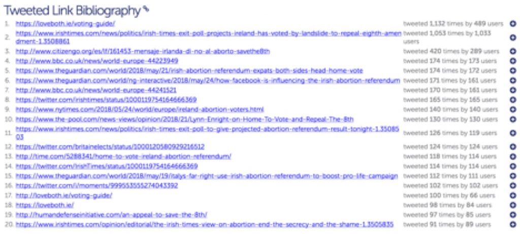
Figure 3. Number of tweets sharing a single URL.
We also noted a difference in the network structures of the pro-repeal and anti-repeal groups. The anti-repeal group was more centrally coordinated by organised campaigns, with a small proportion of users that interacted outside the group, as illustrated in the left panel in Figure 4. In comparison, the pro-repeal group, while having organised campaigns as well, showed less central coordination and more engagement with users outside the group, as shown in the right panel below.
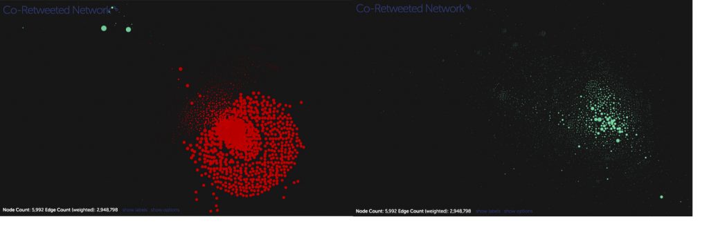 Figure 4.Anti-repeal group and pro-repeal group in coRT (BEFORE)
The presence of bots
We also looked at the presence of bots in the coRT network. Bots on Twitter are mostly automated accounts with high volumes of activity. These accounts sometimes play a vital role in furthering polarisation of a debate or helping the spread of (mis)information. However, not all bots are malicious: many exist for marketing purposes, or for automated reporting of events, such as earthquakes.
Bot detection techniques use account features and the content of tweets to classify the degree of ‘bot’-ness of a particular account. We used Botometer, a widely-used tool for bot classification, to recolour the coRT network and look at whether bots played an important role. The coRT networks are recoloured with bot scores, with lighter nodes being more human-like and darker nodes likely bot accounts. Users for which data could not be collected, either due to the user being suspended or their account deleted, are coloured red.
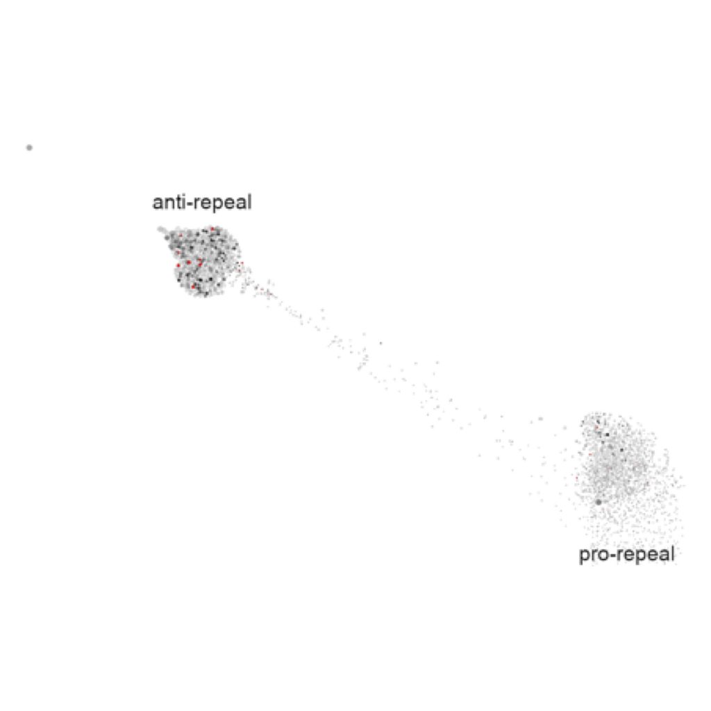
Figure 5. Bot scores for the BEFORE coRT network.
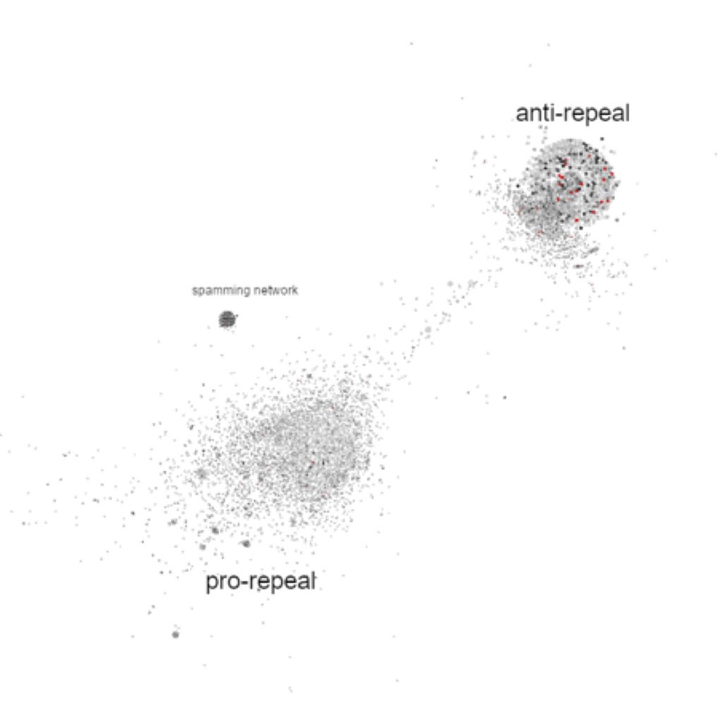
Figure 6. Bot scores for the AFTER coRT network.
Out of the 6,040 accounts in both of the networks, only 269—about 4 percent—got a Botometer score of 3.0 and above, indicating they were likely bots. From Figure 5, we can see that in the BEFORE network, there are more bots and red nodes in the anti-repeal group. In contrast, in the AFTER network, the difference between the two groups in the number of bots is less pronounced, though we note a cluster of bots on the pro-repeal side. These appear to be bots which are spreading the result of the referendum, and do not get retweeted much. The anti-repeal side has more red nodes as compared to the pro-repeal side, which indicates that the accounts were deleted or suspended. However, without access to more data, it is hard to definitively say definitively whether these were bots and whether they played an important role in the anti-repeal discussions.
We also looked at the relationship between size of an account (proportional to tweet volume) and the Botometer score (0–5, with 0 least likely to be a bot, and 5 most likely) of user accounts, shown in Figure 7 below. This clearly shows that bots are significantly more vocal on the anti-repeal (red) side.
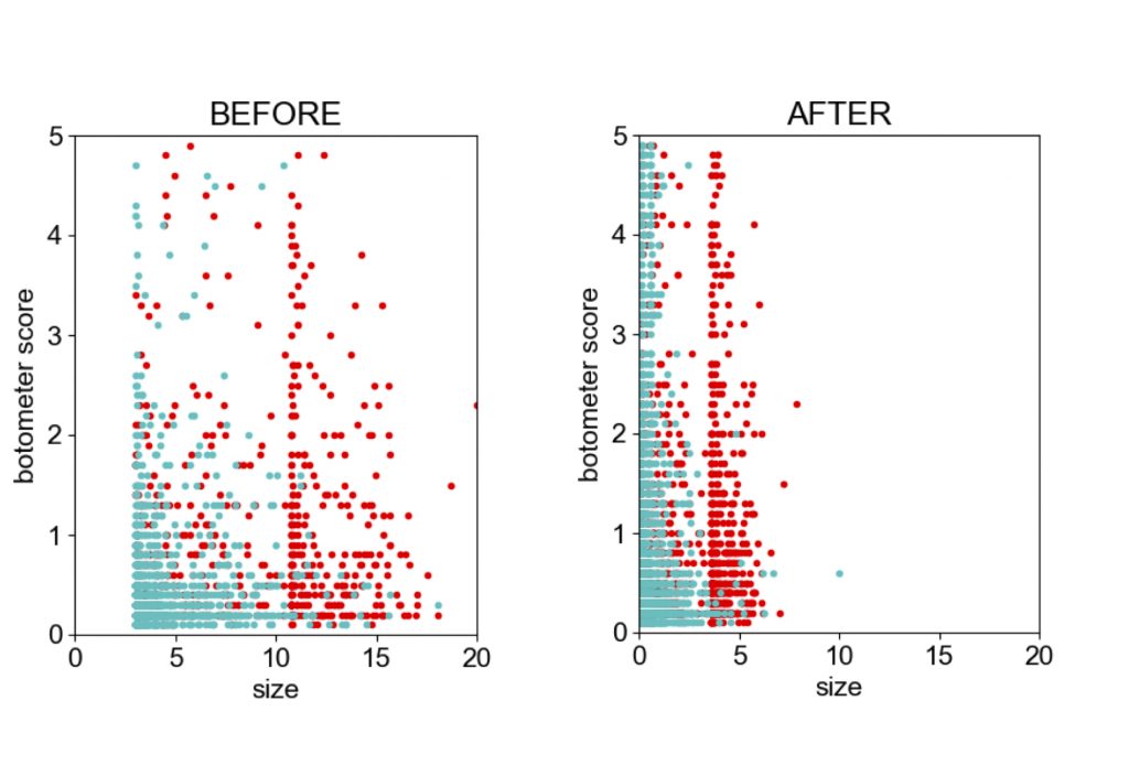
Figure 7. Relationship between size and Botometer scores of user accounts BEFORE and AFTER the referendum. Sizes are comparable within the figures but not across figures.
Conclusion
Our analysis shows that the discussion about the Irish referendum was led by organised campaigns like Savethe8th, rather than bots. This is a heartening observation as organised campaigns, unlike bots of unknown origin, are accountable for their propaganda. Even so, we believe that Twitter should do more to integrate trust information into the platform. There is no reason to expect that the relative absence of influential automated accounts of unknown origin in this case is indicative of a general trend.
From the evidence we have analysed so far, it appears that the Irish referendum was better protected from foreign interference and social media manipulation, with organized campaigns accounting for the bulk of the Twitter conversation. It is too early, however, to assess the effectiveness of the tools introduced by social media companies as they have implemented their policies for political campaigning only recently The next big test for these companies will likely come during the 2018 U.S. midterm elections.
Acknowledgments
We would like to thank Samantha Finn and the TwitterTrails project at Wellesley College, which enabled us to collect data and create visualisations for this blog post.
[i] TwitterTrails was developed at Wellesley College. It provides information on how the stories spread and who is in the network of key people involved in re-tweeting or promoting. In the past, TwitterTrails has looked at the Pizzagate conspiracy theory, the spread of rumours on Twitter, and the development of polarisation.
[ii] The US Presidential elections and Irish referendum might not be directly comparable, as the former was subject to an organised campaign of foreign influence, while such involvement would not necessarily be expected in the latter case.
[iii] These visualisations have been drawn with a force-directed algorithm (ForceAtlas2) in Gephi, which separates groups of nodes based on their interconnectedness frequency: The more often they are linked, the closer they are positioned in the network. With this technique, the nodes that are more closely related are drawn closer to each other. The nodes are also coloured by the community-recognizing Louvain algorithm based on their interconnectedness density: A community is comprised of nodes that have more connections to their each other than those outside of the community.
Comments


