
MPs’ expenses continue to fascinate the British media and public alike. Every autumn, the Independent Parliamentary Standards Authority[1] (IPSA) publishes a detailed breakdown of the House of Commons MPs’ expenses for the year, and news outlets rush to publish their analyses of this data. Tabloids (e.g. Daily Record) as well as broadsheets and magazines (The Guardian, The Economist) create rankings or tools that allow users to compare MPs’ expenses and single out big spenders. Such efforts are contextualised by the inveterate public ire over perceived excesses, exacerbated by the on-going austerity measures and a culture of ‘naming and shaming’.
But most of these comparisons are highly problematic because they fail to provide important contextual information, simply comparing MPs’ total expenses (overall or by budget category, see below). While this exercise does reveal the total ‘cost’ of the MP to the tax payer, using absolute figures to rank or compare parliamentarians fails to account for the crucial fact that different MPs are given different budgets caps.
These caps often vary for reasons beyond the MPs’ control. For example, a parliamentarian’s maximum staffing budget may be increased by IPSA to cover maternity or sick leave taken by a staff member. The failure to acknowledge these external sources of variation suggests that many reports are sacrificing appropriate data standards and fair comparative indicators on the altar of lurid headlines and public attention. While irresponsible and wasteful spending must certainly be flagged, these judgements should be based on a rigorous and accurate analysis of the data at hand.
Here I present fairer and more meaningful indicators to compare MPs’ expenses, using the latest expenses data for Members of the UK House of Commons (2014-15). I thereby hope to elucidate the distorting effects of most existing approaches. Following the UK expenses scandal in 2009, a new claims system was introduced by IPSA, which is responsible for setting the yearly allowances as well as individual budget increases. The claims system is broken down into travel costs, accommodation expenditure, and office costs, which is split again into office expenditure and staffing.[2]
Crucially, not every MP is given the same budget cap in each category. In what follows, I use two approaches to take this into account. First, I compare only MPs who belong to the same budget group. Second, I use measures that reflect an MP’s level of spending against the overall budget available to him or her (i.e. how much the MP claims as a percentage of the specific budget). In the final section, I present a new factor that appears to significantly impact MPs’ spending levels, namely, the electoral margin by which the MP won his or her constituency.
Office and staffing expenses
The yearly allowance cap (i.e. the maximum an MP can spend) for office costs and staffing is by far the highest among the three budget categories and varies significantly between different MP groups for two main reasons: First, the allowance cap for London MPs is nearly £10,000 higher than for MPs outside the capital (£171,400 instead of £161,850)[3]. In fact, the difference is even more substantive considering that the budgets are for one year only. (It amounts to nearly £50,000 over a whole five-year parliamentary term.)
Second, a significant number of MPs receive so-called ‘uplifts’ to their allowances to cover costs related to staff absence (e.g. maternity or long-term sick leave). MPs are not allowed to meet these costs from their standard budget.[4] In 2014-15, over 100 MPs received increases averaging £7,400 and ranging between £170 and £36,000 (standard deviation of £6,900, suggesting large variation).
While the factors described above are largely beyond the MPs’ control, they have a significant impact on an MP’s total amount claimed. This received no attention in the comparison tools created by the Economist or the Guardian.[5] The absence of this information, whether deliberately excluded or not, leads to an unfair ranking system.
MP Jo Swinson, for example, is singled out in one newspaper headline for being among the top 10 highest claimants of 2014-15. In the article, Swinson herself explains that “[l]ast year my staffing costs were significantly higher than usual due to the need to provide cover for three members of staff who were on maternity leave. All other budgets were underspent as usual.”
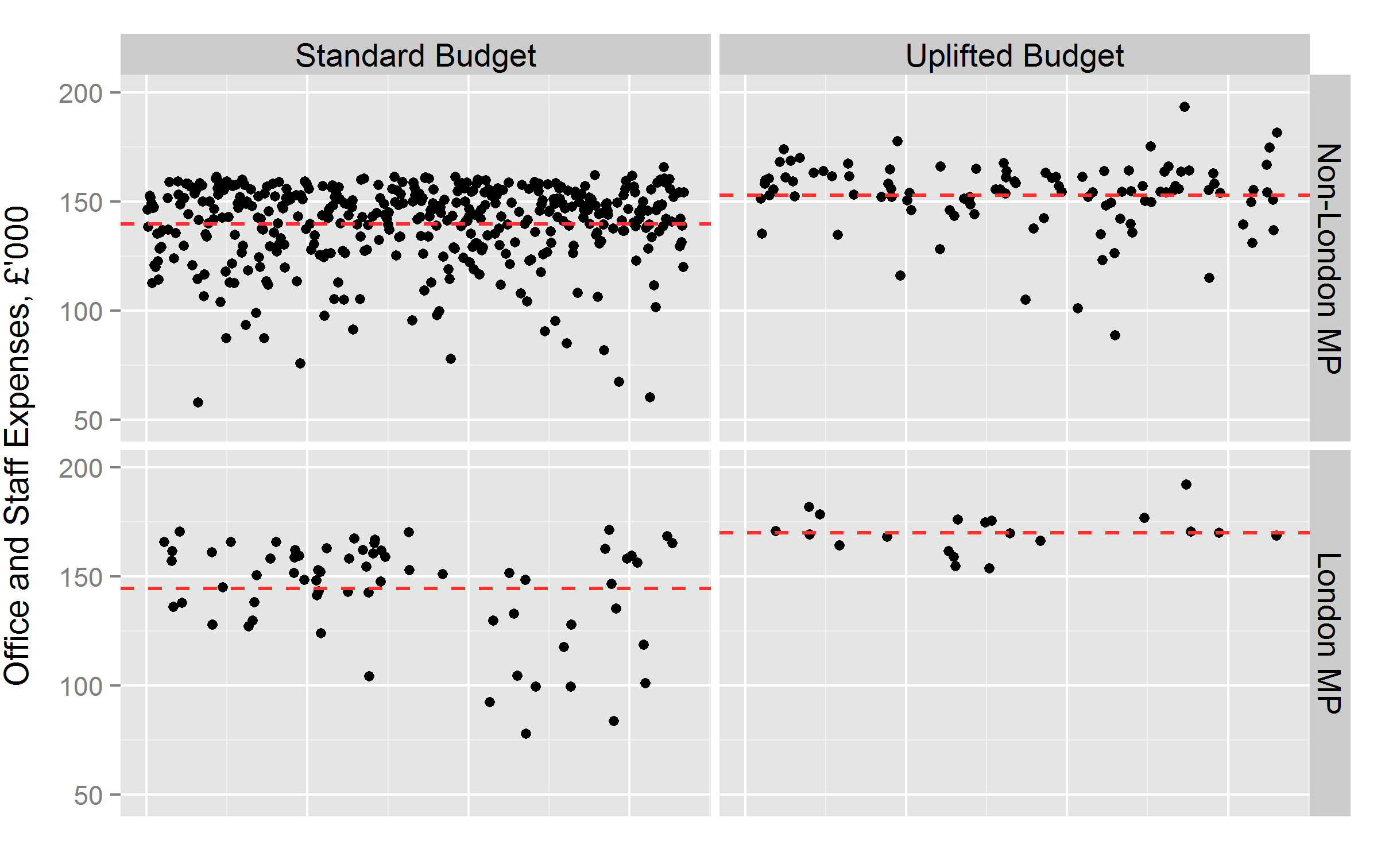
My first approach (Graph 1) takes these factors into account by dividing MPs into groups according to their office budgets. This step enables us to compare like with like, making a direct comparison of absolute spending totals more meaningful. The top left box, for example, shows that none of the many MPs who received a standard, non-London office budget significantly sticks out in terms of high spending.[6]
We may be able to single out the most frugal MPs, but ‘naming and shaming’ the high spenders is difficult because many MPs go right up to the budget cap of £161,850. A similar observation can be made about London MPs with a standard budget (bottom left). Looking at the right hand column in Graph 1, we observe more variation at the higher spending level, but this predominantly results from the large variation in extra allowances received by MPs (see above). A comparison of these absolute numbers therefore remains difficult.
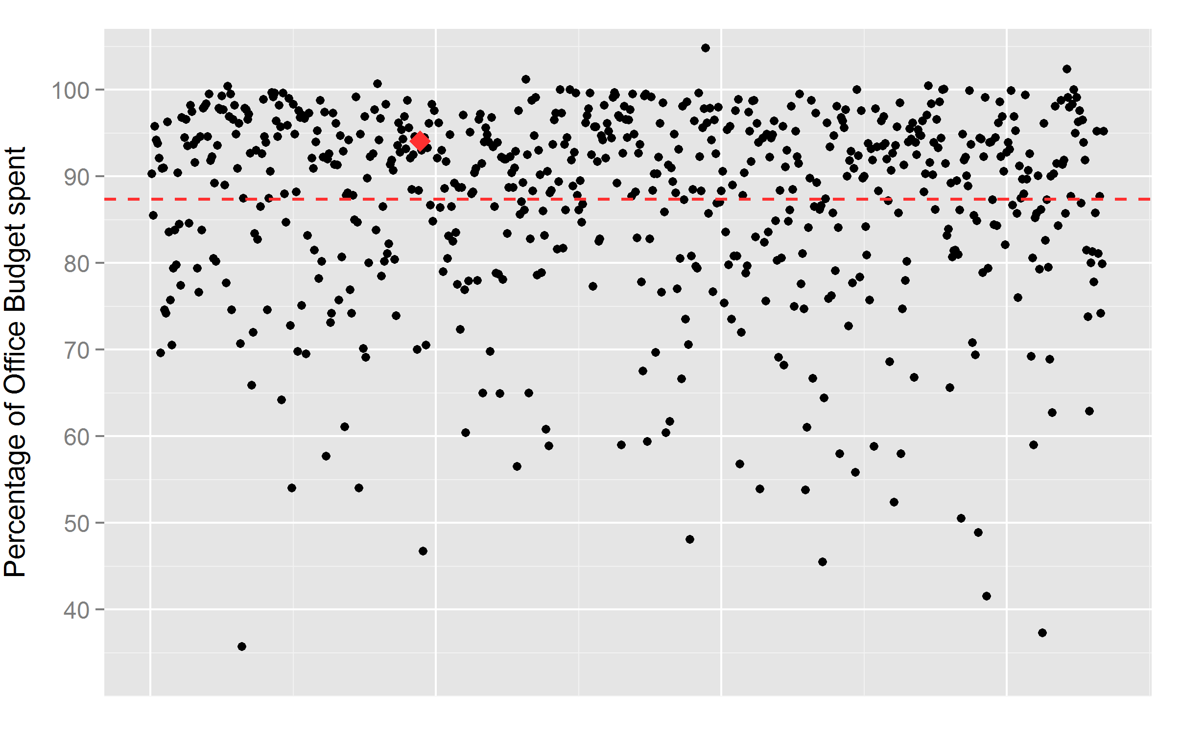
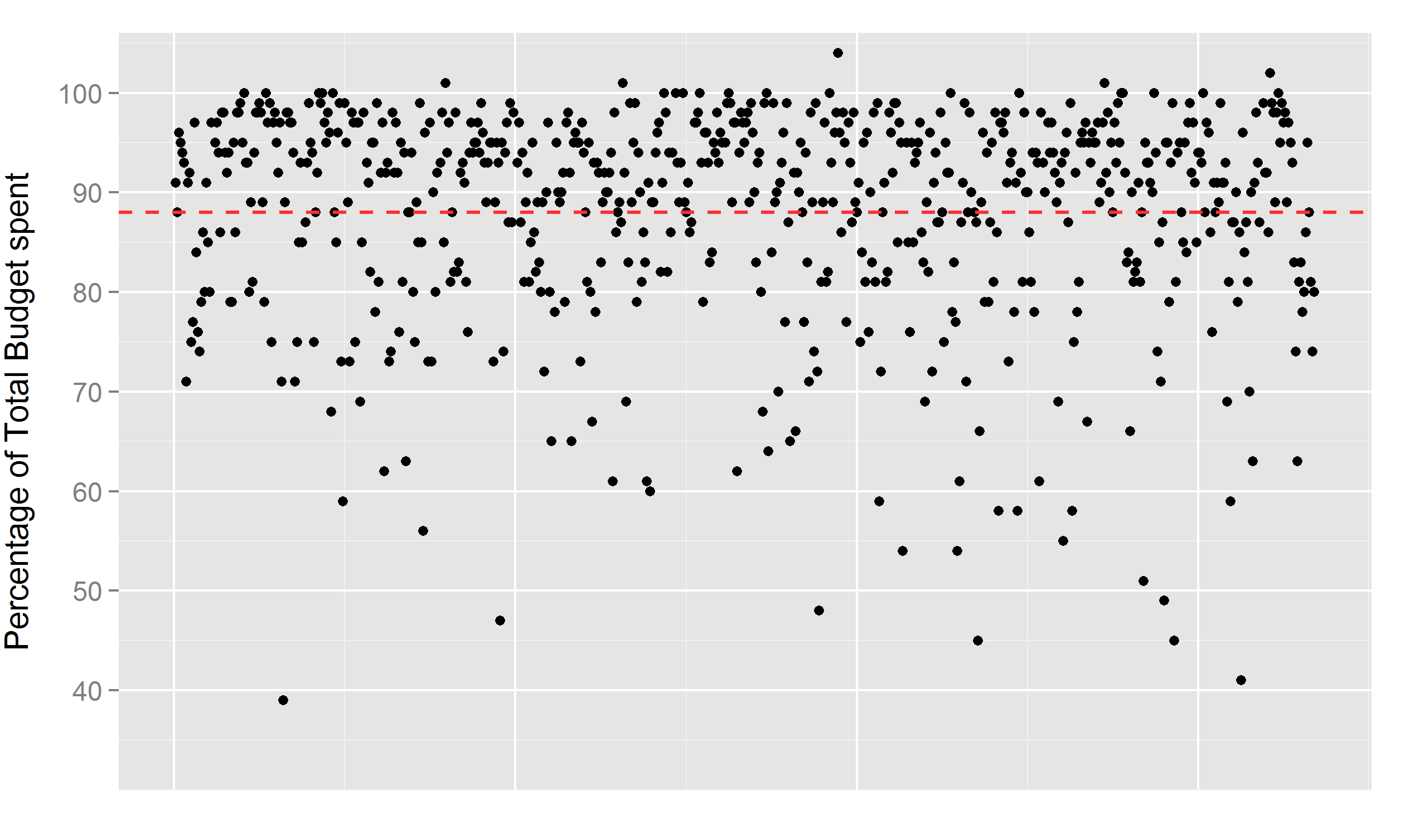
Graph 2 provides some correction for this. It shows the percentage each MP spent of his or her individual staffing and office allowance and reveals that over half of MPs use between 90 and 100 per cent of their budget. Interestingly, Jo Swinson, who was pilloried for being in the top 10 of the year’s claimants, lies well within this band at 94 per cent (see the red dot). Apart from a handful of over-spenders (above the 100 per cent line[7]), the graph again demonstrates the difficulty of singling out individual high-spenders, though significant variation can be observed at lower levels of spending.
Commentators and news outlets seem to shy away from more objective measures, like looking at the percentage of budget spent, in favour of sensational findings. Alas, a headline along the lines of “Revealed: The 10 most wasteful MPs” is probably more appealing to readers than “The 10 most frugal MPs”, and I suspect that ‘naming and shaming’ sells more newspapers and attracts more clicks than ‘naming and praising’.[8]
Accommodation expenses
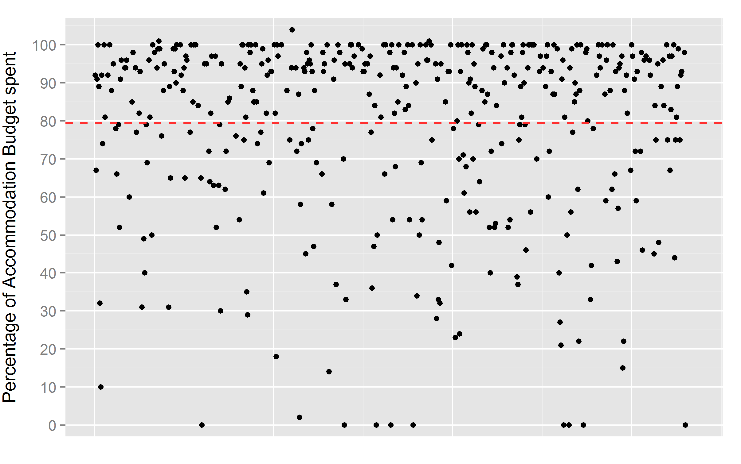
Similarly, budget caps to cover accommodation costs vary greatly. MPs can choose either to claim for London or constituency accommodation (except London MPs), and can be divided into five budget groups. First, 183 of the 652 MPs in the dataset cannot claim for accommodation, including London MPs[9] and those occupying ‘grace and favour’ accommodation through their political positions. Second, 73 MPs have a set budget of £8,850 for utilities at a property they own. Third, 52 MPs receive a budget for accommodation in their constituency, which varies between £10,400 and £18,625 (averaging £13,300, standard deviation of £2,600) depending on the constituency band and number of dependants (an extra allowance of £2,425 is paid for each dependant).
Fourth, 262 MPs receive the London accommodation budget, which has a standard rate of £20,600 but can climb as high as £32,725 for MPs with five dependants (average of £22,000 and standard deviation of £2,500). Finally, 62 MPs are granted an uncapped budget to stay in hotels (average of £9,500, standard deviation of £4,700), and the remaining 20 MPs receive a mix of these budgets due to category changes during the year.
The main cause of variation in accommodation expenses therefore lies in the divide between the 183 MPs who cannot claim for accommodation and the rest. Indeed, a glimpse at the Economist’s “heat map” reveals regional patterns, the most noticeable of which is that MPs from London and the surrounding area appear to spend less overall. However, these important regulations on accommodation budgets again remain unexplained in the Economist’s and the Guardian’s comparison tools.[10]
To ensure a more objective comparison, Graph 3 shows what percentage of his or her individual accommodation budget each MP uses. Naturally, this graph excludes the 183 MPs who cannot claim for accommodation, as well as the 62 MPs whose accommodation budgets are uncapped. The graph again indicates that nearly half of MPs fall within the 90 to 100 per cent band, and that there is significant variation at lower levels of spending.
It should be noted that the non-London MPs have some discretion in choosing which accommodation type to claim for (i.e. the MP has more control over that decision than, say, staff maternity leave). The variation in expenses therefore provides the media with greater leverage to point out frugal or the spendthrift MPs. Before doing so, however, it is essential to acknowledge explicitly the relevant regulations and the crucial fact that one-third of MPs cannot claim for accommodation.
Travel expenses
MPs can claim travel expenses for journeys ‘which are necessarily incurred in the performance of the MP’s parliamentary functions’ (Section 9.2 of “The Scheme”). In 2014-15, MPs claimed an average of £5,900 (standard deviation: £5,000). It is reasonable to expect that travel expenses—and therefore overall expenses—increase with the distance between an MP’s constituency and Westminster.
To test for this, I use geographical coordinates of MPs’ districts[11] to calculate the distance and travel time to Westminster in: 1) minutes it takes to drive by car; 2) minutes it takes by public transport; 3) kilometres covered by car; and 4) kilometres as the crow flies. Unsurprisingly, all four measures are highly correlated with travel expenses (correlations over 0.6, at p<0.01): the farther away a constituency, the higher the travel expenses. Distance from Westminster thus provides another, rather obvious explanation for some of the regional patterns observed on the Economist’s “heat map”.
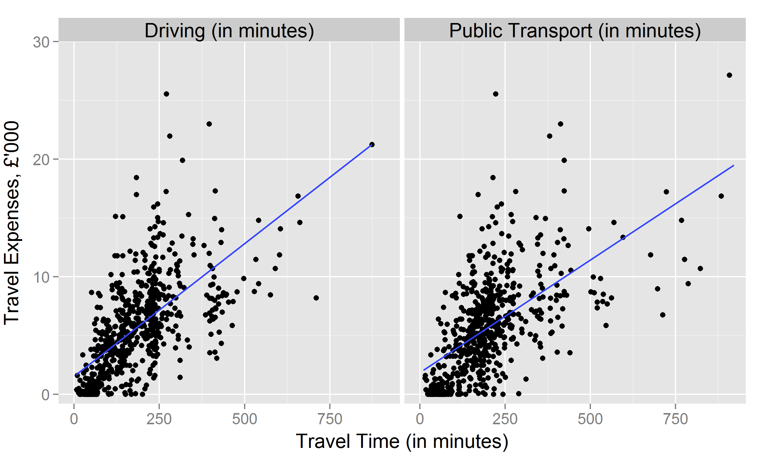
Graph 4 shows descriptive statistics of indicators 1) and 2) against total travel expenses for each MP and includes fitted linear regression lines. The graph suggests that an investigation of MPs’ travel expenses should focus on those highest above the fitted line.
Finally, to assess overall spending, Graph 5 shows the percentage spent by each MP as measured by his or her total budget (i.e. the sum of all expenses claimed in categories with a budget cap divided by the sum of all budgets, multiplied by one hundred). As has been the case in Graphs 2 and 3, the majority of MPs fall within the 90-100 per cent band, making it difficult to single out individual high-spenders (barring a small number of MPs who overspent on their budgets). It is noteworthy that Jo Swinson, at 95 per cent, again falls in the middle of the 90-100 per cent band.
What else can explain differences in MPs’ spending levels?
Breaking down MPs into various groups allows us to account for specific causes of variation. Even after introducing these controls, some MP-level variation remains in the amount of expenses claimed (both in absolute terms and in percentage of budget claimed). Once we have taken account of factors that MPs cannot control, we can examine determinants on an individual level. While a detailed analysis would go beyond the scope of this article, I would like to point out one highly interesting factor that appears to impact MPs’ spending levels: their electoral margin.
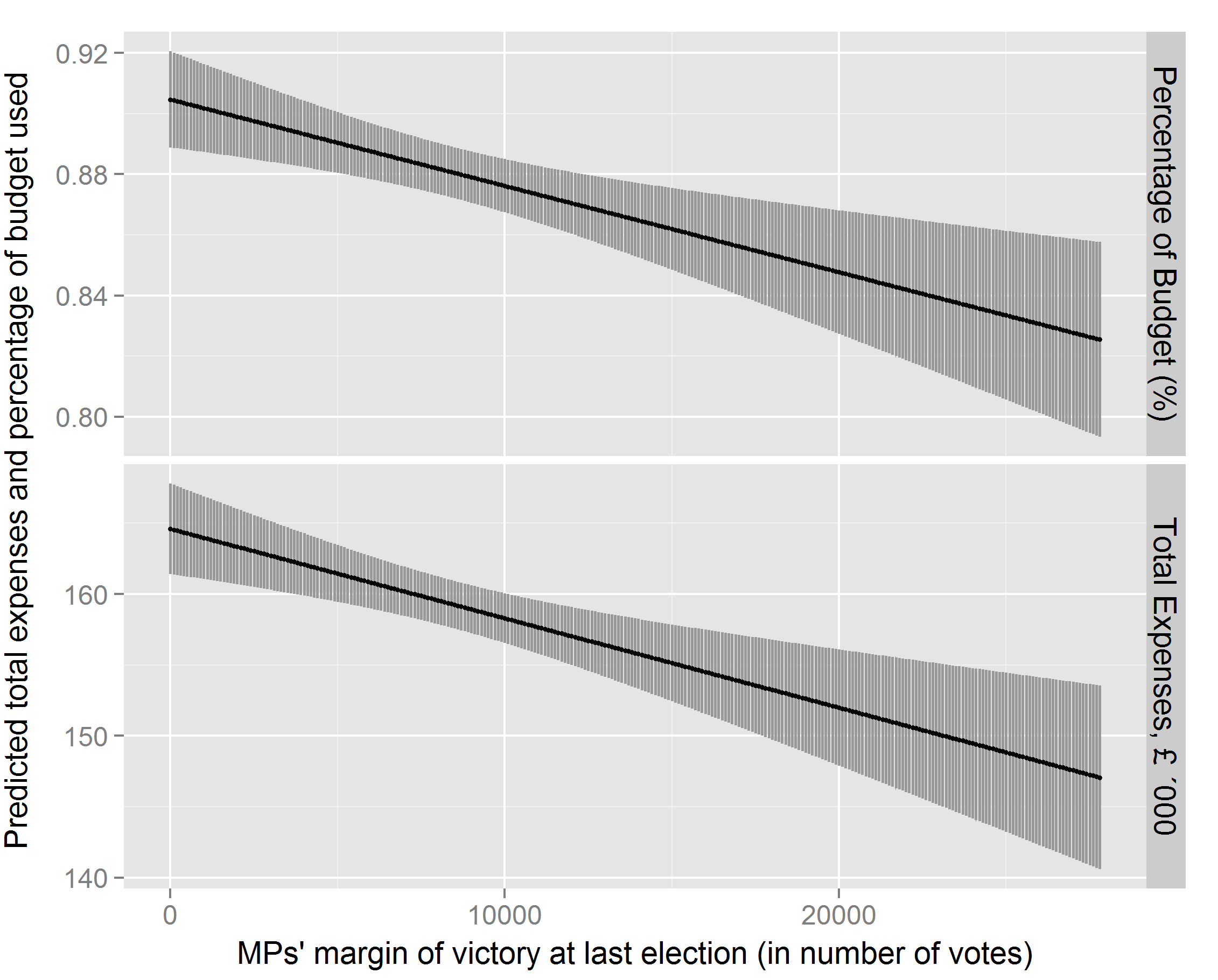
Graph 6 shows predicted probabilities from two simple OLS regressions, one with the MP’s percentage of budget spent as the dependent variable and one with the MP’s total expenses claimed as the outcome variable. The independent variable is the MP’s margin of victory in his/her constituency (i.e. number of votes the MP received over the second-placed candidate). To take into account the aspects explained above, I introduce the following control variables: MP received an office budget uplift; MP is a London MP; MP held a frontbench position in 2014-15[12]; MP stood down at the next election; the time it takes to drive from the constituency to Westminster; and the MP’s party affiliation.[13]
The data suggests that the smaller an MP’s margin of victory (i.e. the less electorally “safe” the MP’s seat) the higher the predicted overall spending, at a statistically significant and substantive level. In fact, from the widest to the narrowest margin of victory, total predicted spending in absolute terms moves from £147,000 to just under £165,000 – a difference of £18,000.[14]
This preliminary finding appears plausible since MPs who are electorally more vulnerable have a greater incentive to use all available resources to boost their re-election chances. They might spend more on travel to visit their constituencies or require more time from their staff members.[15] Whether or not the expenses budget should be used for these purposes shall be left as an open question. Interestingly, MPs appear undeterred by the possibility of being labelled a big spender, despite potential negative consequences for their re-election bids.
Towards a more informed assessment of MP expenses
Comparisons of MP expenses in the media are often highly deficient. They omit crucial explanations and qualifications, and allow MPs to be singled out on the basis of distorting and ill-conceived metrics. Of course, some parliamentarians act irresponsibly with regard to their expenses and deserve to be held accountable, but we should identify them through an objective and fair assessment.
Some might argue that this kind of precise examination is an exercise in splitting hairs. It is true that certain MPs spend more than others – and to some, that fact is all that matters: the overall cost of an MP to the taxpayer. Given the intense public interest in individual spending levels, however, one would – perhaps naïvely – hope for a higher standard of data analysis, as well as more detailed explanations. It is understandable that the media leans towards eye-catching rankings and stories, but in this particular case, news sources have a responsibility to provide the full picture.
References
[1] IPSA was created in 2009 in the wake of the expenses scandal to provide independent regulations and ensure greater transparency.
[2] There is a fourth category of so-called “one-off additional costs”. This category is not analysed separately here since the vast majority of MPs file no related claims and the average expense is only 112 GBP. The claims from this category are, however, included in the figures on the MPs’ overall expenditures (see below).
[3] Encouragingly, some reports in local London newspapers (e.g. Brent & Kilburn Times, Islington Gazette) include information on London MPs’ higher office budgets and compare expenses across the capital only.
[4] Four MPs also received an additional “winding up” uplift and another four a “starting up” uplift. These MPs are included in the Uplifted Budget category in Graph 1.
[5] In fact, it appears somewhat ironic that the Guardian’s data blog that provides this ranking and comparison tool carries the subtitle “facts are sacred”.
[6] For better visualisation, the top left box does not show one MP whose total office spending was less than £1,000. The MP is included in the average. Moreover, Graph 1 only shows MPs with standard or uplifted budgets, excluding 50 MPs who received minor budget reductions due to overspend in the previous year.
[7] This occurs because MPs can overspend on the budget but then face a reduction in the following year.
[8] For a refreshing exception, see this article by a local newspaper pointing to the frugality of an MP.
[9] This includes MPs in the larger London area, beyond the London boundary drawn in the Economist’s map.
[10] Again, for an exception, see this article, in which an MP explains that one reason for her comparatively low expenses is precisely because she cannot claim for accommodation.
[11] Coordinates obtained from here. Northern Irish MPs are not included in Graph 4, as constituency coordinates were not available on the website.
[12] Note, however, that MPs cannot claim expenses related to ministerial work.
[13] Limited to MPs from the three major parties (i.e. Liberal Democrat, Labour, Conservative).
[14] It should be noted that as the data analysed here is from the year leading up to the 2015 general election, it is likely that the effect is particularly pronounced during this time.
[15] Indeed, running the regressions with travel and office expenses as dependent variables yields a similar magnitude of effect as shown in Graph 6.
Comments

